CSS系列-2.CSS选择器
写在前面的话
本文包含选择器的其他应用包括画各种图形
为了就仅仅是展示CSS. 以后统一用如下html结构
1 |
|
一般选择器
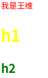
通配符选择器
1 | *{color: blueviolet;} |
1 | <body> |
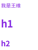
元素选择器
1 | p{color:red} |
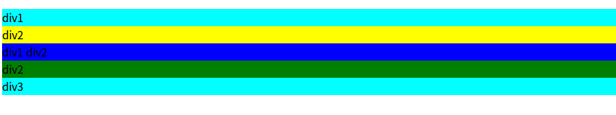
类选择器
1 | .div1, .div3{ /*逗号分割同级选择器 div1 div3 同级 */ |
1 | <div class="div1"> |
属性选择器
1 | div[class]{ |
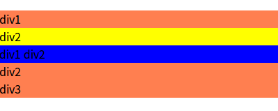
可以看出来属性选择器优先级大于类, 但是对 .div.div2和 .div .div2 这种是覆盖不了的(覆盖不了后代和多个class的情况)
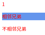
兄弟选择器
相邻兄弟:1
2
3
4
5<div>
<p class="bro">1</p>
<p>相邻兄弟</p>
<p>不相邻兄弟</p>
</div>
1 | .bro + p{ |
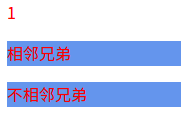
通用兄弟:1
2
3.bro ~ p{
background-color: cornflowerblue;
}
伪类和伪元素选择器
伪类选择器
伪类顺序:link-visited-focus-hover-active
- 静态伪类
静态伪类只能应用在超链接1
2
3<div>
<a class="first" href="http://www.baidu.com">百度</a>
</div>
1 | .first:link{ |

动态伪类
严格按照focus - hover - active 不然无效1
2
3
4
5
6
7
8
9.dynamic:hover{ /*鼠标悬浮*/
background-color: crimson;
}
.dynamic:active{ /*正被点击*/
background-color: blueviolet;
}
.dynamic-input:focus{ /*获得焦点*/
background-color: aquamarine;
}目标伪类
原来一直没有搞懂目标伪类的意思
比如下面的代码是在 #target1 成为目标时(url + ‘#target1’), id为target1的这个元素的样式
比较常用, 比如一个侧边的导航栏, 我点击哪个, 进入哪个对应的页面, 哪个选项变色1
2
3
4#target1:target{
color: cornflowerblue;
background-color: blueviolet;
}
- UI元素伪类(IE8-不支持)
1
2<input class="ul"/>
<input class=".checked" type="checkbox" />
1 | .ul:enabled{ |
- 结构伪类
E:first-child(IE6-不支持) 父元素的第一个子元素,且该子元素是E,与E:nth-child(1)等同
E:last-child(IE6-不支持) 父元素的最后一个子元素,且该子元素是E,与E:nth-last-child(1)等同
上述情况父子同类
E F:nth-child(n) 选择父元素的第n个子元素,父元素是E,子元素是F
E F:nth-last-child(n) 选择父元素的倒数第n个子元素,父元素是E,子元素是F1
2
3
4<div class="parent">
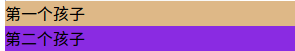
<div class="structure">第一个孩子</div>
<div class="structure">第二个孩子</div>
</div>
1 | .parent .structure:first-child{ |
伪元素选择器
和伪类的区别是, 伪元素更..细…可以为了方便理解为作用在innerHTML上的
first-letter, first-line , 只能作用在块级元素, 且first-line覆盖不了first-letter
1 | <div> |
1 | .element::first-letter{ |
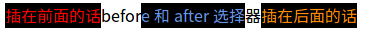
before和after选择器, 默认这个伪元素是行内元素, 非块级可用1
<span class="be-af">before 和 after 选择器</span>
1 | .be-af::before{ |

::selection 匹配被用户选择的部分, 目前只支持::
firefox加 -moz-: -moz-selection:: 目前只支持 color和background两个属性1
2
3
4
5.be-af::-moz-selection{
content: '选中后添加';
color: cornflowerblue;
background-color: black;
}
除了content外
attr() 和 url()注意不要加 ‘ ‘1
2
3
4
5
6
7.be-af2::after{
content: attr(class);
}
.be-af2::before{
content: url(https://raw.githubusercontent.com/Wangwei0223/markdown_photos/master/test-image/J.fla.png);
}
CSS伪元素的各种应用
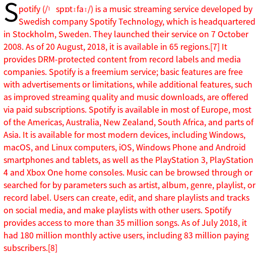
首字下沉1
2
3
4
5
6<div style="width:500px">
<p class="first-letter-down">
Spotify (/ˈspɒtɪfaɪ/) is a music streaming service developed by Swedish company Spotify Technology, which is headquartered in Stockholm, Sweden. They launched their service on 7 October 2008. As of 20 August, 2018, it is available in 65 regions.[7] It provides DRM-protected content from record labels and media companies. Spotify is a freemium service; basic features are free with advertisements or limitations, while additional features, such as improved streaming quality and music downloads, are offered via paid subscriptions.
Spotify is available in most of Europe, most of the Americas, Australia, New Zealand, South Africa, and parts of Asia. It is available for most modern devices, including Windows, macOS, and Linux computers, iOS, Windows Phone and Android smartphones and tablets, as well as the PlayStation 3, PlayStation 4 and Xbox One home consoles. Music can be browsed through or searched for by parameters such as artist, album, genre, playlist, or record label. Users can create, edit, and share playlists and tracks on social media, and make playlists with other users. Spotify provides access to more than 35 million songs. As of July 2018, it had 180 million monthly active users, including 83 million paying subscribers.[8]
</p>
</div>
1 | .first-letter-down::first-letter{ |
画一个钉子1
<div class="ding"></div>
1 | .ding::before { |

延伸知识: 画各种图形
原理首先要知道, 不然干想是想不出来的, 不然太牛逼了
原理利用: border
border 包括border-top | bottom | right | left -width , border-style: dashed soild, border-color: transparent 和各种颜色
1 | <div class="square"></div> |
1 | .square{ |
我定义了4个颜色, 方便观看. 如果用before和after要记得加content:’’ 和display:block

之后把 width和height 变为 0

之后比如我想要上方的就单独定义border-top, 可以重新定义 border-top-width 来画非等边1
2
3
4
5
6.cube {
width: 0px;
height: 0px;
border: 50px solid transparent;
border-top: 100px solid red;
}
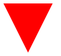
想取不同形状的, 可以把 border-left / border-right / border-bottom / border-top 其中的设置为 0

扩充到半画圆1
2
3
4
5
6.semi-circle{
width: 100px;
background-color: royalblue;
border-radius: 100px 100px 0 0; /*% 注意是全部占地大小, padding + content + border*/
height: 50px; /*高度取宽一半才是半圆*/
}

扇形1
2
3
4
5
6.sector {
width: 50px;
height: 50px;
background-color: brown;
border-radius: 0px 0 100px 0;
}

border-radius的四值1
border-radius: 0px 0 100px 0; /*分别是左上, 右上, 右下, 左下*/